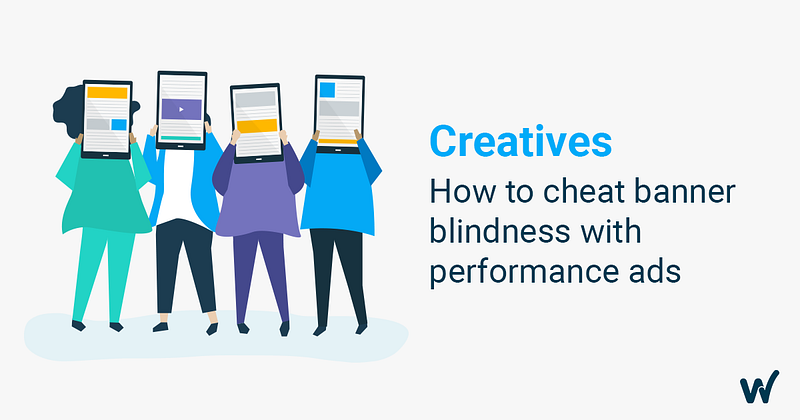
Getting the attention of potential users is getting much harder every day. We’ve been bombarded by information and messages since we can recall. This competition for gaining our attention is stressing us out. Today our brain’s attention is consuming tons of data from smartphones, computers and other connected devices. So when you are running your campaign ads, you’re not just competing with what the user is consuming on his phone but also with the whole world that surrounds him/her.
The mobile and technology evolution made us develop something called users banner blindness. When we unconsciously ignore certain messages and elements when we recognize them as ads.
This behavior is a consequence of our limited attention capabilities as human beings. If we were to pay attention to every sound, image, and movement that surrounds us, we would be overwhelmed and become unproductive.
As a marketer, there are a few tricks that you can use in your favor when building an ad creative to “cheat” banner blindness. Check these 5 tips!
1 — Use the whole potential of your ad format:
Don’t make your ad look like an ad. Every creative format size needs to be customized, designed differently and need their own aesthetic. Leverage the size of your ad, a 320×50 creative shouldn’t be the same as a 1024×768. The first one is smaller so you need to be very concise with a clear call to action and the second one is bigger so you can use impactful images. A/B test different colors, call to actions and elements based on each placement
2 — Animate your Creatives:
Movement always called human attention, paying attention to anything that moves was an organic survival mechanism that we keep in our system until today. The way to stimulate it is by using videos, gifs and any moving elements on your ads. It’s very likely that they’ll have better performance than static ones.
3 — Don’t go crazy:
Please don’t exaggerate the movements and animations. It can make your creative annoying and not attractive to the user. So A/B test different creatives with different movements, but please take it easy.
4 — Measure Events, Signs, and Hypothesis
The user’s behavior is your validation tool to build an ad that communicates a popular and interesting feature of the app. Measuring important events, understanding them and how the users interact is not only helpful when building relevant ads but also to build new app features.
Paula Neves, Product Manager at Square Enix, explains on this Adjust video in a very clear way how creating user personas for your app, can guide you on where you should invest your efforts.
5 — Build a Clear Message
Remember to keep your message simple and concise. Short and, clear messages tend to hold people’s attention much longer. You can also try different tones of voice to see how your users react to them.
Attention is clearly one of the most valuable resources of digital marketers. Most of the advertisers don’t exploit it on their creatives as they should. Companies are migrating to a more data-driven culture, but some aspects of human behavior are left aside and not contemplated., Still, we need to keep them in mind to get the most out of our growth and creatives strategies.
Data without any Human intervention still means possible complications. That’s why in Winclap we created Ad Science. A technology that joins the creativity and innovation of human art with, data measurement methodologies, and research of science. Every ad that is created is based on human experience & data science.
I know all this information may sound overwhelming. If you feel like you don’t have the resources or the time to put into practice the tips above, our Ad Science team can definitely create and develop a creative strategy that will help you to have more impact and have powerful growth.
If you want we can help you prioritize your needs, talk to one of our growth experts by filling the form below.

Recent Comments